
NEW performancetrucks.net banner!!!
 04-11-2011, 10:06 PM
#51
apple bottom jeans
Join Date: Dec 2006
Location: Lucan, Ontario
Posts: 1,312
Likes: 0
Received 0 Likes
on
0 Posts
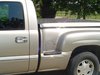
http://www.flickr.com/photos/61646962@N07/5612174090/http://www.flickr.com/photos/61646962@N07/5612174090/ by http://www.flickr.com/people/61646962@N07/, on Flickr


 .. The P has to be in capital though...


 04-12-2011, 07:54 AM
#56
apple bottom jeans
Join Date: Dec 2006
Location: Lucan, Ontario
Posts: 1,312
Likes: 0
Received 0 Likes
on
0 Posts
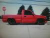
http://www.flickr.com/photos/lg-rg/5613213292/http://www.flickr.com/photos/lg-rg/5613213292/ by http://www.flickr.com/people/lg-rg/, on Flickr
I didn't go caps because the T is all funky looking, but I like the font otherwise. I'm going to hunt for a cursive font that doesn't look so weird in caps.
I didn't go caps because the T is all funky looking, but I like the font otherwise. I'm going to hunt for a cursive font that doesn't look so weird in caps.


 04-12-2011, 11:16 PM
#60
Teching In
Join Date: Mar 2011
Location: North Hills, Ca
Posts: 4
Likes: 0
Received 0 Likes
on
0 Posts
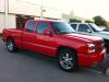
^^^ now that's a banner I can agree on! Looks pretty good! Needs a little bit of work but the concept is legit! Plus as far as logos, stickers and shirts this is the most practical one and best one I've seen for that application... Just saying....